Peak Form Performance
Packaging Design Project
2024 — Revisited 2026
Peak Form Performance began as a college packaging design project in early 2024, centered around creating a bold, high-impact brand identity for a fictional sports performance supplement company. The original assignment challenged me to develop a complete visual system — including logo design, flavor variants, label layouts, and realistic product mockups — while considering shelf presence, hierarchy, and consumer psychology.
The concept focused on energy, intensity, and competitive edge, expressed through aggressive typography, dynamic composition, and high-contrast color palettes tailored to each flavor. The goal was to design packaging that felt powerful, performance-driven, and built for a gym environment.
In 2026, I revisited and fully rebranded the project to reflect my growth as a designer. The updated version refines the typography, improves layout structure, strengthens visual hierarchy, and elevates the overall brand system with more cohesive art direction and polished mockups. This redesign showcases not only improved technical skill, but a stronger understanding of branding consistency, packaging realism, and market positioning.
Peak Form Performance represents both where I started and how far I’ve progressed — making it a benchmark project in my creative development.
Original 2024 Final Submission
These designs represent my original final submission for Peak Form Performance in early 2024. At the time, I felt I had executed the project well—building a full identity system, packaging layout, and product line that reflected the bold, high-energy nature of the fitness industry. The typography, heavy gradients, supplement panel integration, and strong vertical type treatments were all intentional decisions based on my skill level and design instincts at that stage.
Looking back now, it’s been fascinating to watch this work “age.” As I’ve grown more confident in restraint, hierarchy, and brand cohesion, I began to see areas where the design felt overworked, crowded, or stylistically forced. What once felt polished slowly started to feel visually heavy and less refined.
Rather than hide that evolution, I chose to revisit and redesign the project—using the same core concept but applying a sharper eye, stronger hierarchy, cleaner typography, and more intentional brand language. This comparison marks an important milestone in my development as a designer: understanding that growth often means outgrowing your past work.
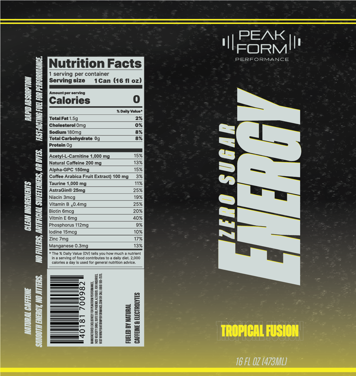
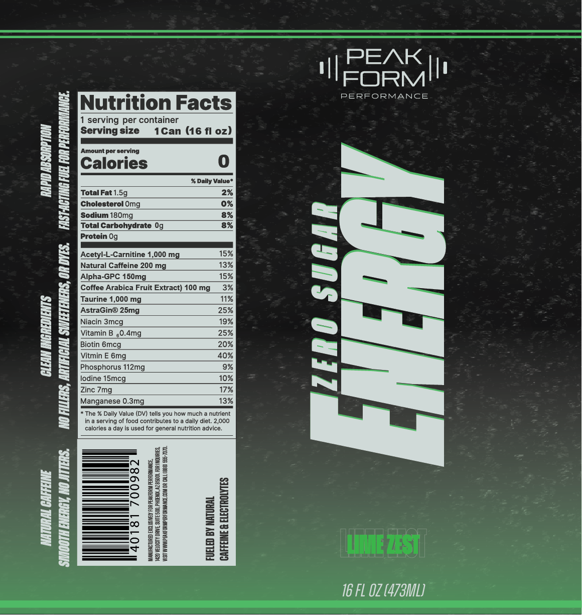
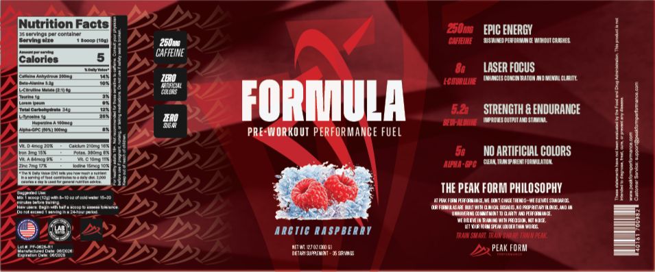
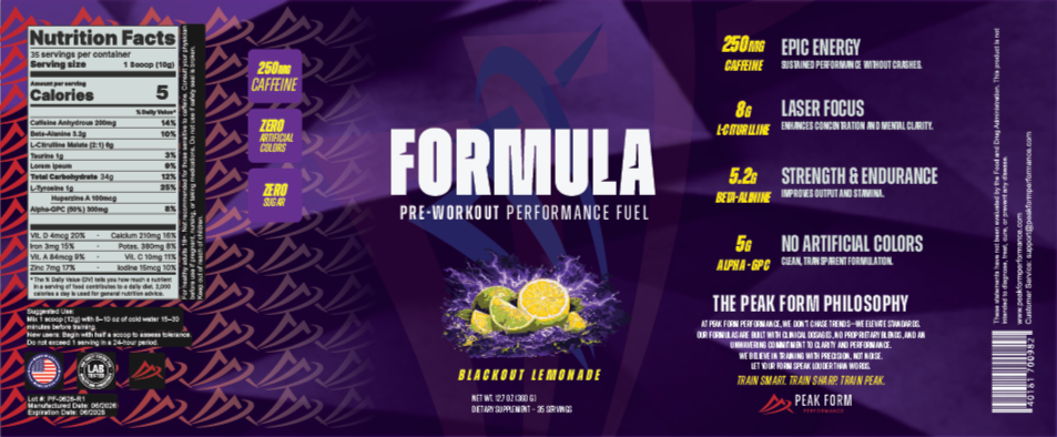
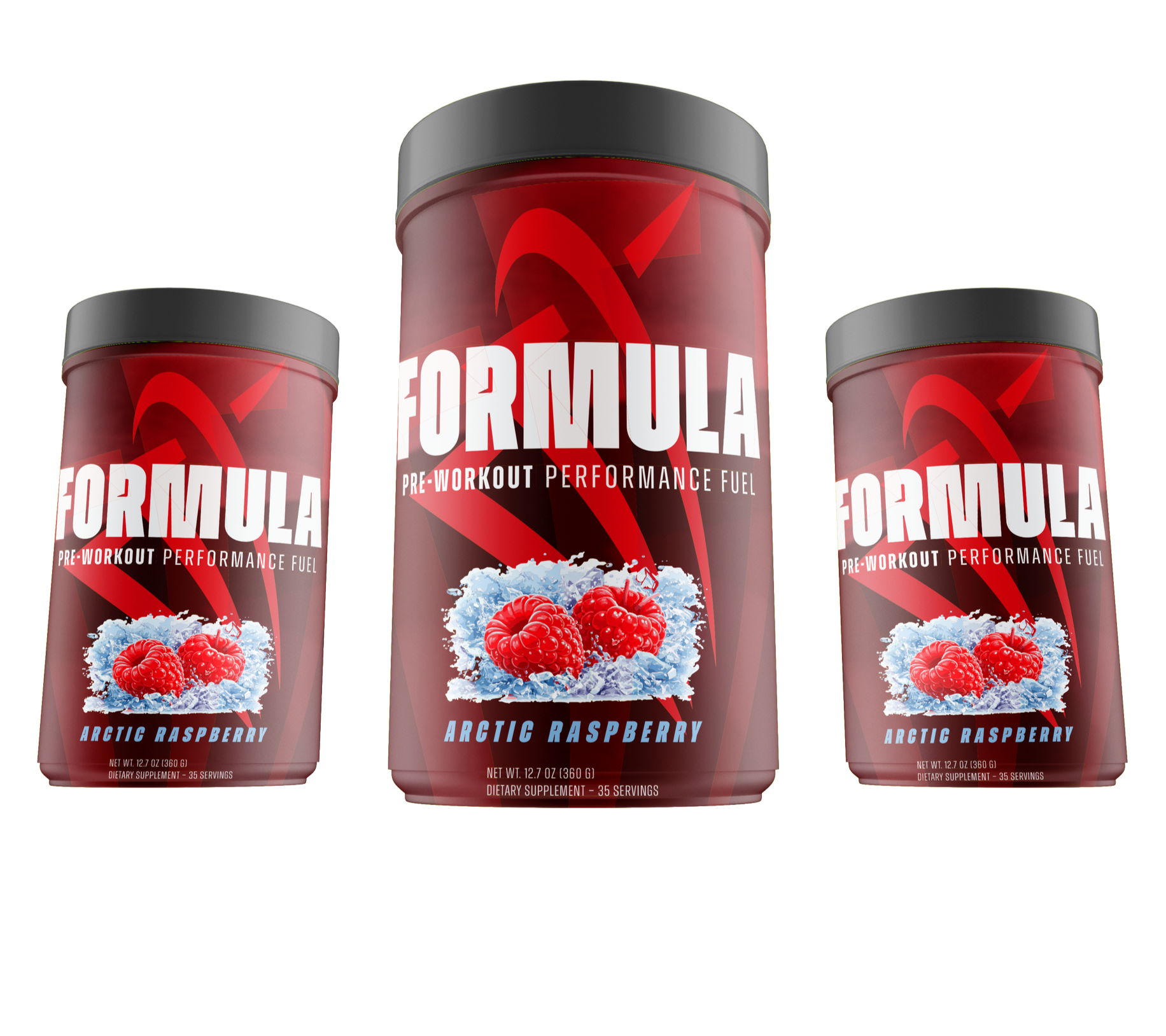
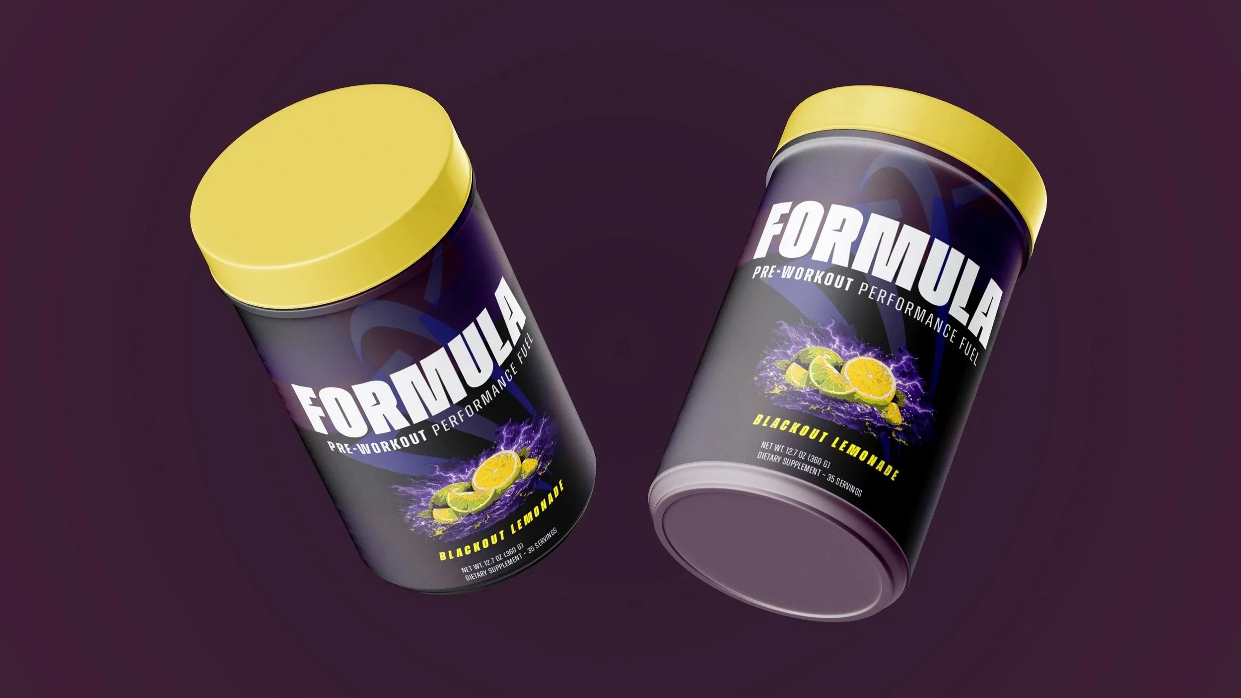
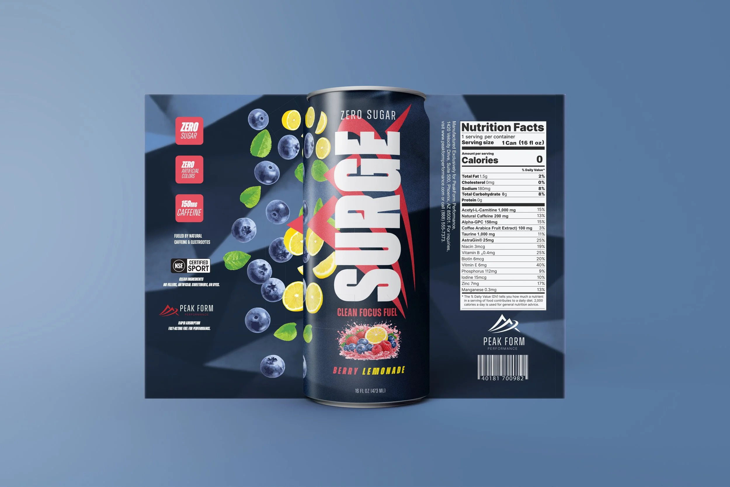
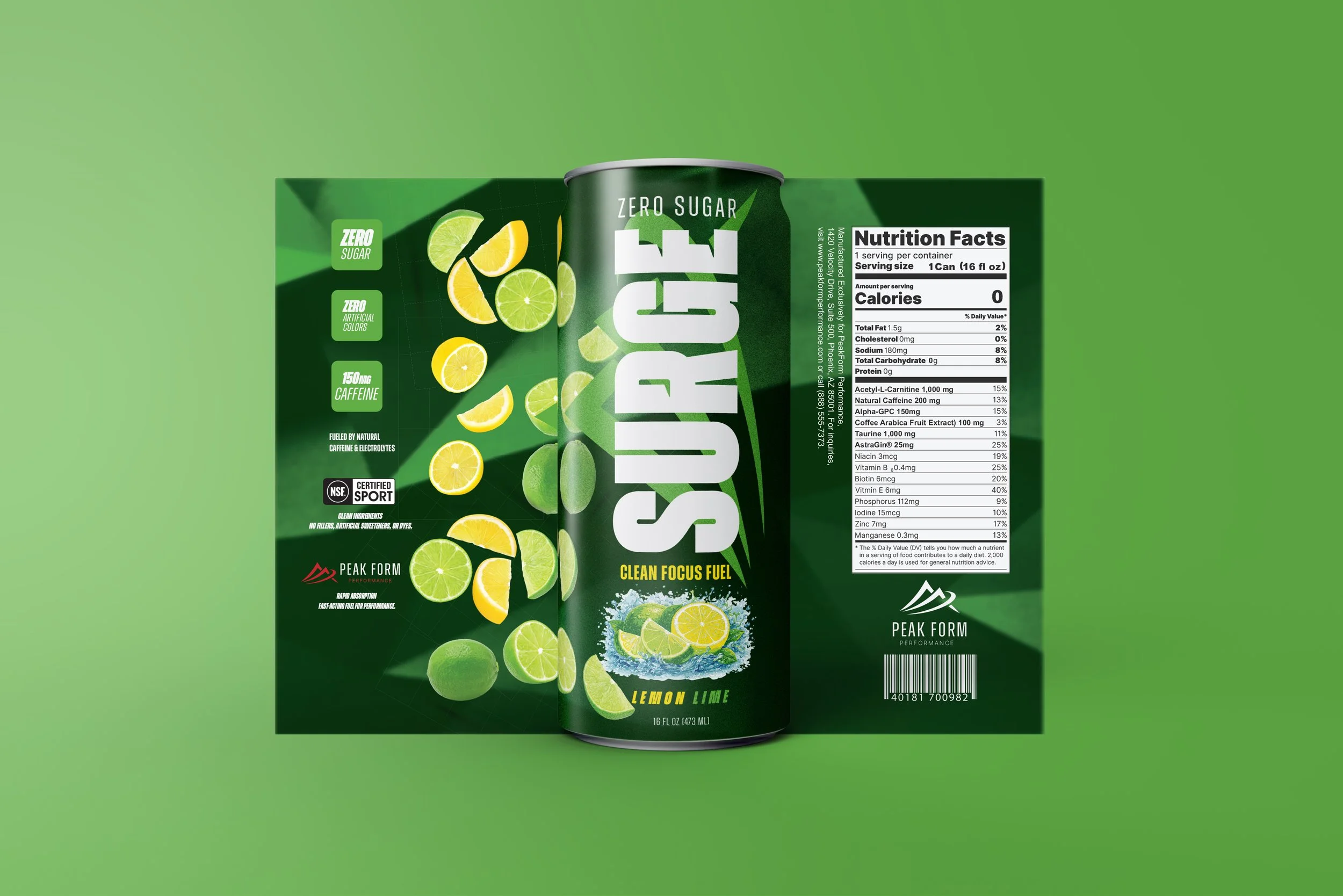
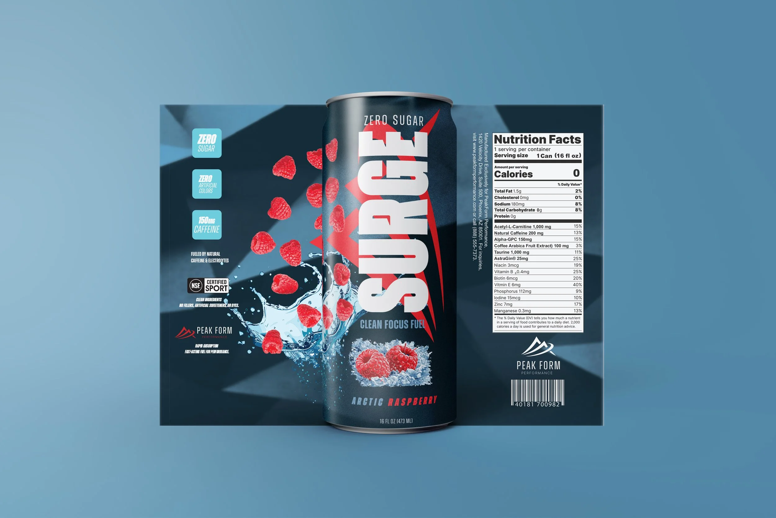
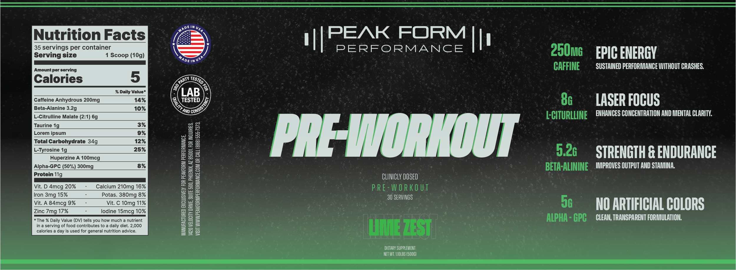
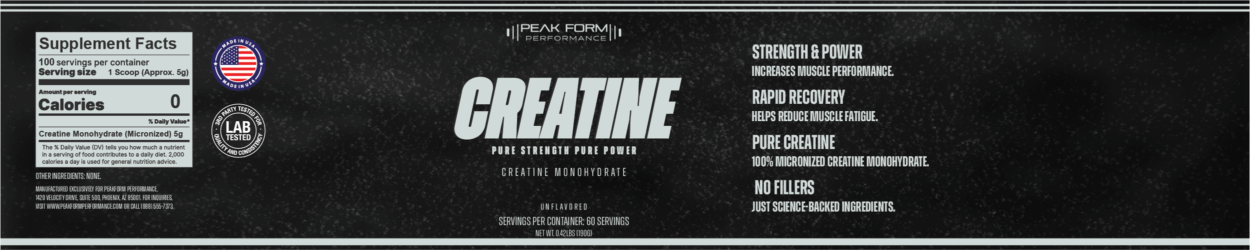
As part of the original Peak Form Performance project, I developed a cohesive product line consisting of a pre-workout formula, creatine supplement, and a 16oz energy drink. Each product was designed with three distinct flavors while maintaining a consistent and unified brand identity across all packaging. From typography and color accents to layout structure and nutrition panel integration, every variation was built to feel like part of the same performance-driven system—showcasing my ability to think beyond a single label and create a scalable, retail-ready brand family.
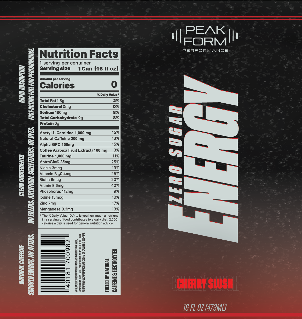
REFINED. REBUILT. REIMAGINED.
Two years later, I revisited Peak Form Performance with a sharper eye and a stronger skill set. The updated designs elevate the brand through cleaner typography, stronger hierarchy, improved color balance, and a more intentional packaging system. What was once a solid student project has evolved into a more confident, market-ready identity—reflecting growth not just in software ability, but in design thinking, restraint, and overall brand cohesion.
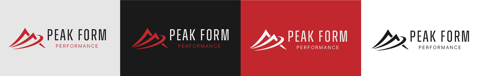
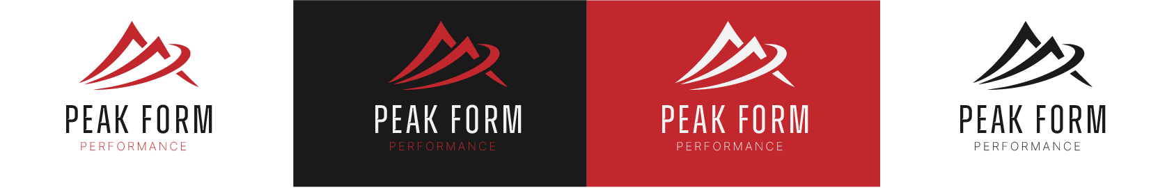
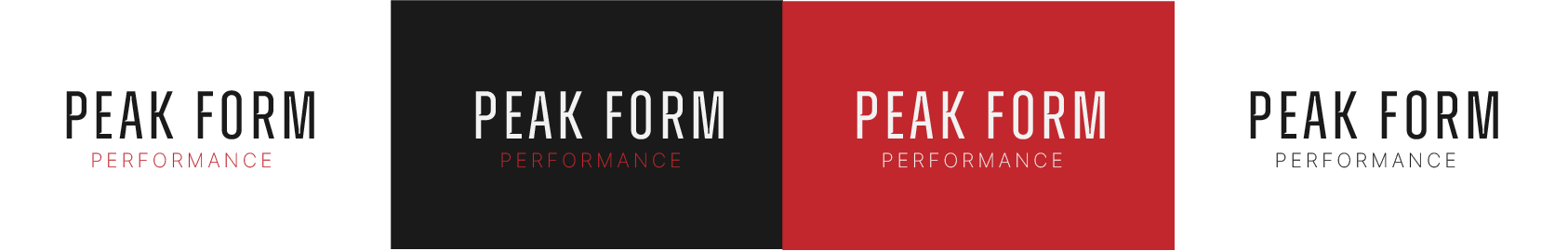
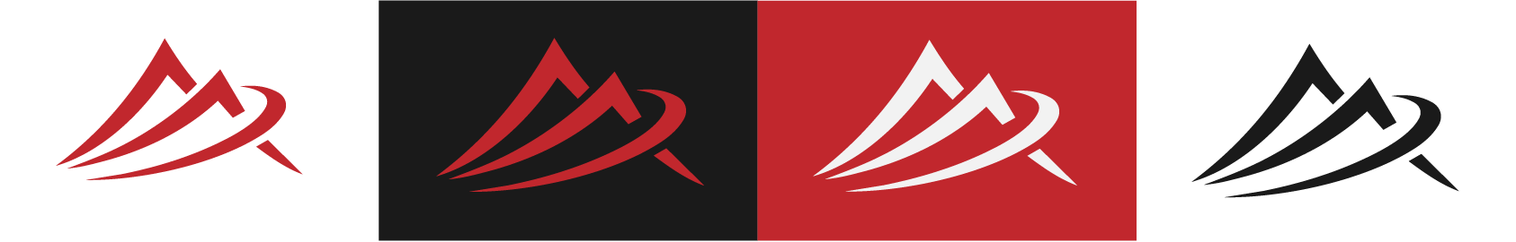
Refined Logo System — Peak Form Performance
The updated Peak Form Performance logo system reflects a more mature, intentional brand direction rooted in strength, clarity, and forward momentum. The custom wordmark has been refined for stronger spacing, improved legibility, and a more confident typographic presence, while maintaining a high-performance, athletic feel. The sharp, angular letterforms communicate precision and discipline—core values of both sport and training.
The brandmark introduces a dynamic mountain form paired with a sweeping motion element, symbolizing ascent, progress, and peak achievement. The flowing curve adds movement and energy, reinforcing the idea of performance in action rather than static strength. Together, the elements create a cohesive identity system that is bold, versatile, and scalable across packaging, apparel, and digital applications.
The refined color palette—black, white, and performance red—enhances impact and versatility while reinforcing a premium, competitive edge. This updated system feels cleaner, stronger, and more confident, reflecting both the evolution of the brand and my growth as a designer.v